Beyond Infinity
Interactive Visualization to Explore The History of Space and Interplanatary Travel
Beyond Infinity
Interactive Visualization to Explore The History of Space and Interplanatary Travel
Role
Interaction Designer, Visual Designer, Developer
Details
Group project (team of four), 3 months
Tools used
Pen & Paper, Sketch, Photoshop, D3.js, HTML, CSS
Users
People who are enthusiastic about the space missions. Also, teachers and parents whom would want to introduce these topics to children.
TL;DR
Problem Description
We aim to provide an exploratory visualization system of space missions that helps people explore and learn numerous interesting facts in the space trips. We also hope to raise an interest in space travel for people again.
Our approach
We use a scrollytelling approach to tell the birth of space travel & the space race. At the end we provide an in depth detail of all the interplanetary missions that users can interact with to get more insights through its various variables.
Demo Video
Understanding the data
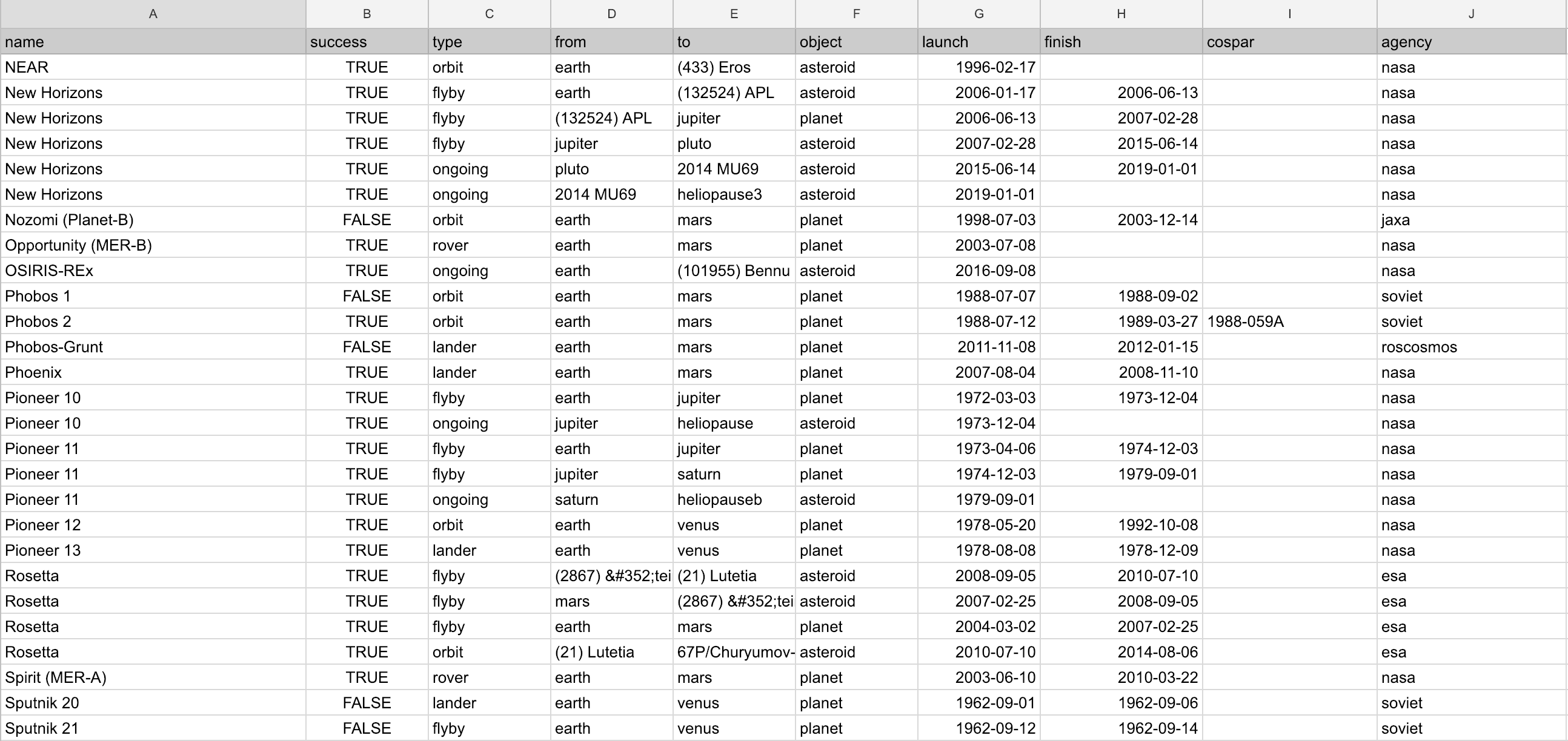
Interplanatary dataset
As someone who has been fascinated with space travel, I found this dataset of all interplanatary space missions which ended up being our primary dataset.
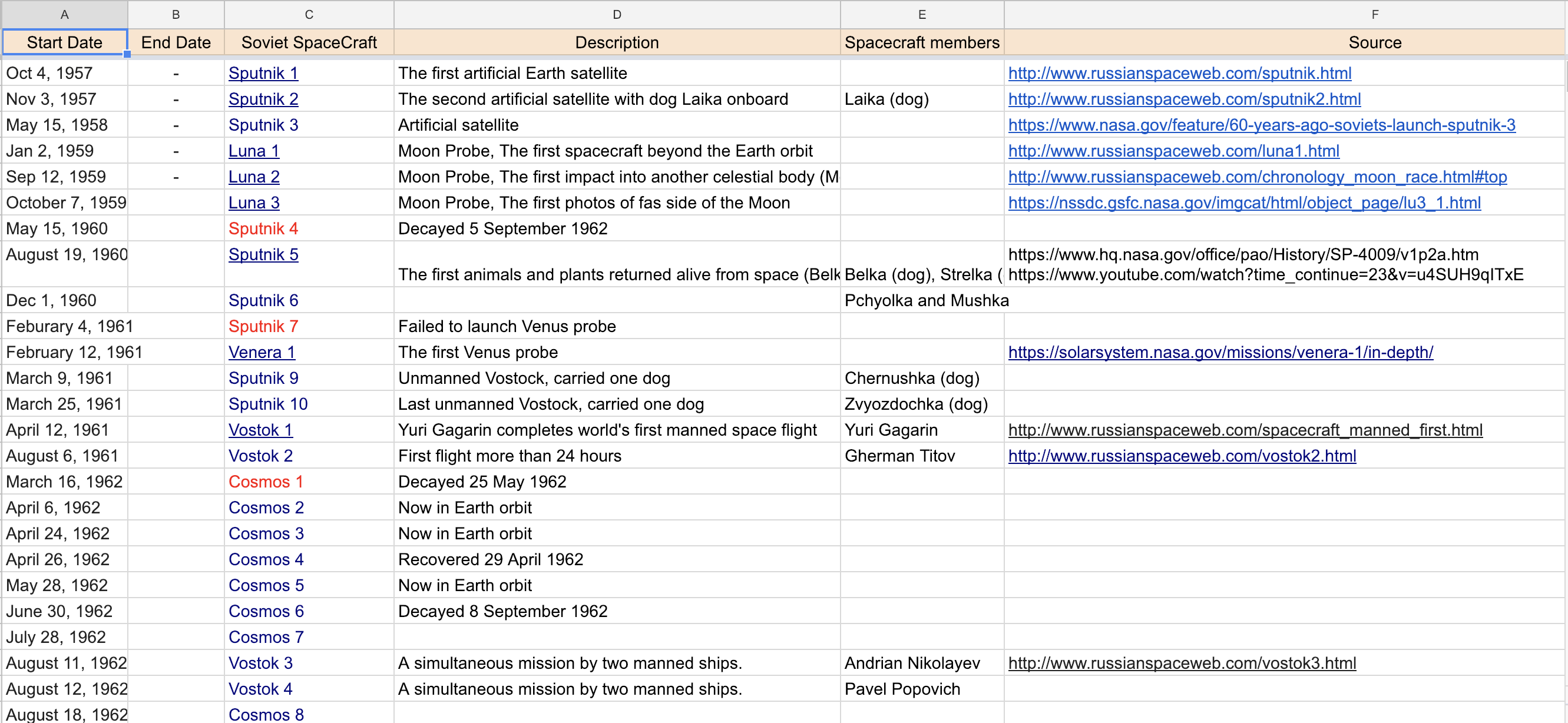
Space-race dataset
We decided to focus on the space-race as introduction to our viz and due to lack on any single dataset, a couple of my teammates created the following dataset by combining data from multiple sources.
Target Audience
After the initial understanding of the data, we went on deciding the audience we were catering to
Middle and High school students who are interested in space missions.
Teachers and parents whom would want to introduce these topics to children.
Researchers who are interested in space mission data.
The key feature of the target audience is the mixture of novices and experts, which requires the design to balance easily understandable visualization and in-depth space missions knowledge.
User Goals
Based on our understanding of the data and the user, we finalized a set of goals that our visualization should help the user achieve
Gain domain knowledge
Getting a brief understanding of when the space travel began? when did interplanetary travel start? What
were the reasons for these missions ?
Gain more information about space missions.
Identify the firsts in space travel.
Get answer to questions like first person in space; first death in space; first animal in space; first human on the moon.
Identify trends.
Are there any trends over the past years in terms of different missions based on the destination planet, country, type of missions etc. If yes, what do the trends look like and how noticeable are they?
Compare missions and planets
Compare different missions based on mission types, destination, multi-hop or single-hop and other parameters.
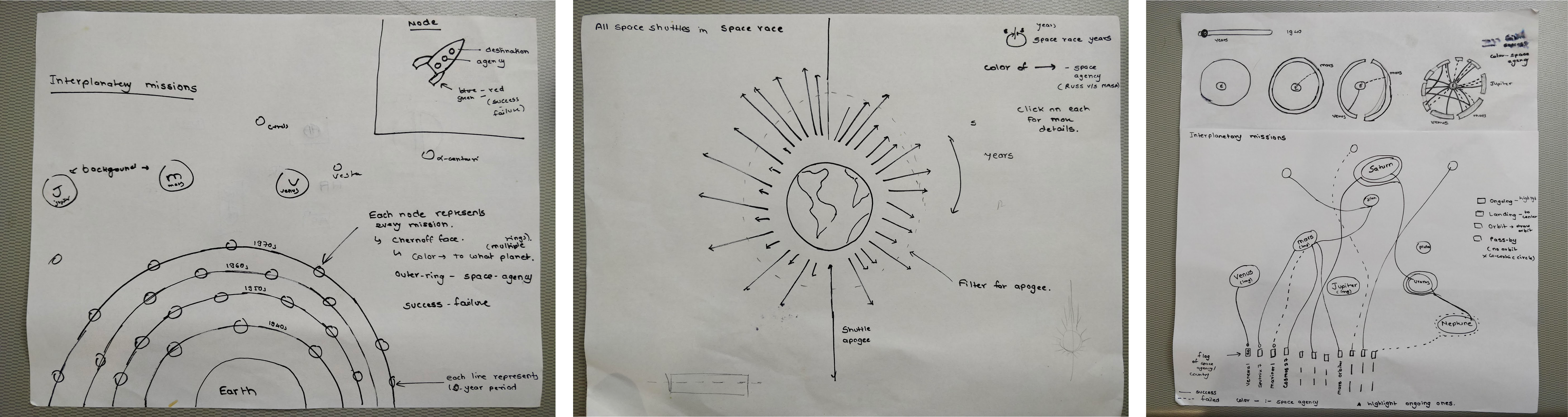
Initial Sketching
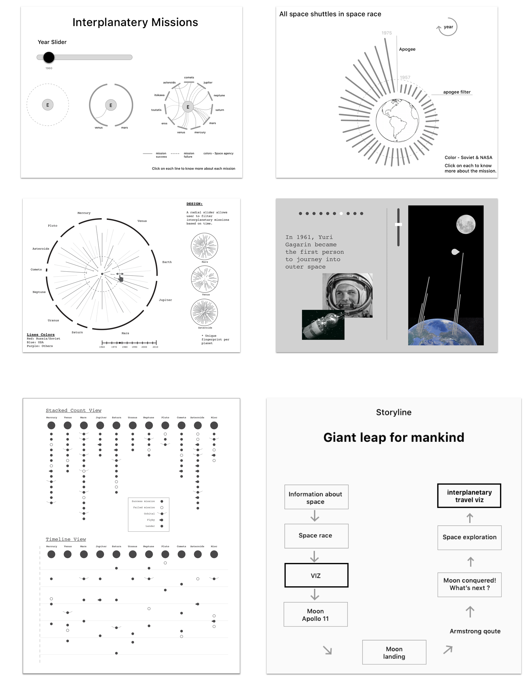
The team first diverged to brainstrom and roughly sketch out concepts. In this phase, I focused on efficient usage of the multiple attributes in an overview visualization. These are some of the sketched I made at this phase.
Medium fidelity designs
Iteration-1
After more brainstorming sessions post the initial sketching and getting feedback on the ideas, I turned some concepts into medium-fidelity design for an in-class design feedback session.
Iteration-2
After getting feedback on our initial design, we went through another round of iteration to create the following designs.
We presented the above design alternatives again and obtained valuable feedback
The scrolley-telling part needed more refining as it has to convey milestones in the space race and for the interplanetary missions, the single view was not doing justice for the rich dataset and did not insite more interactions to drill down for details.
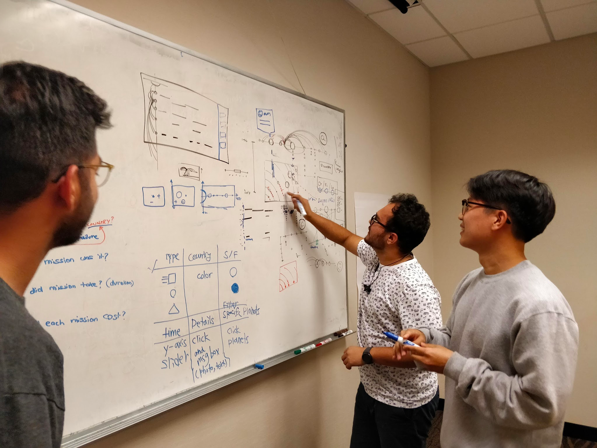
Design sessions followed
I initiated and led a couple of design sessions to iterate further on our design by incorporating the feedback received in previous rounds.
We decided to club the following two information visualization concepts we learned in class in order to refine our design
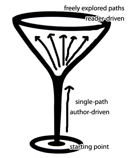
Martini Glass Approach
Single path story leading to freely explored paths
Schneiderman's Mantra
Overview first, zoom and filter, then details-on-demand
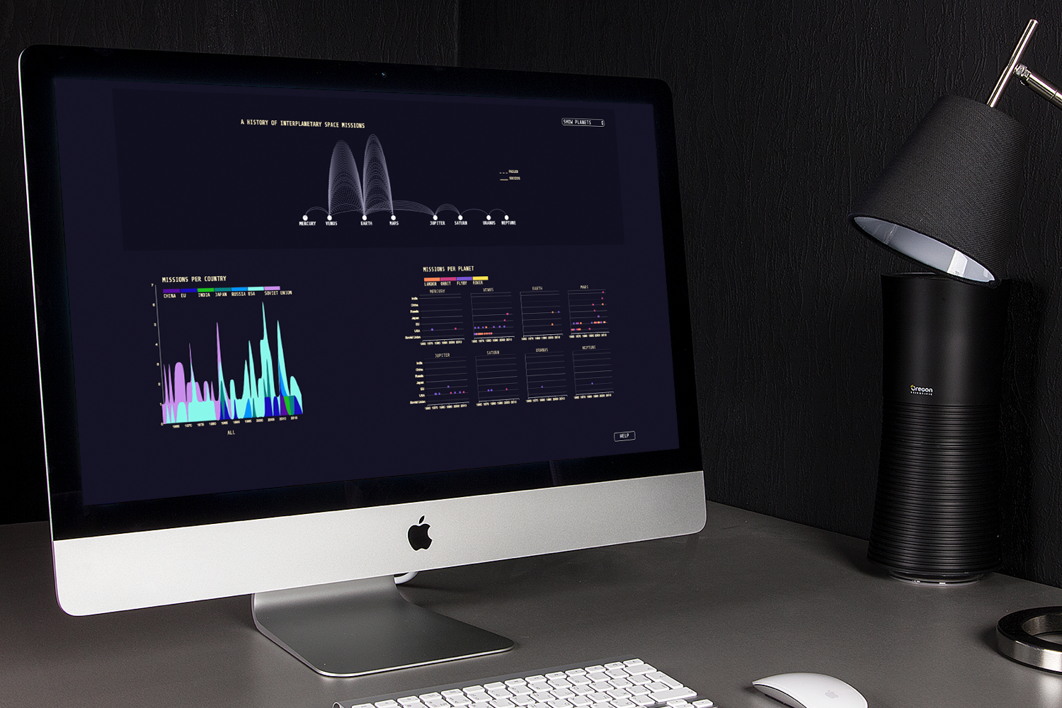
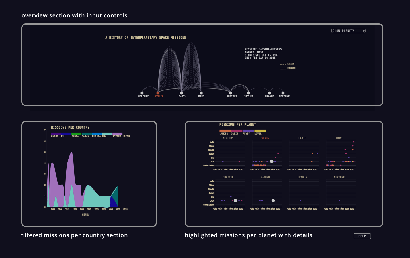
High fidelity interface and layout
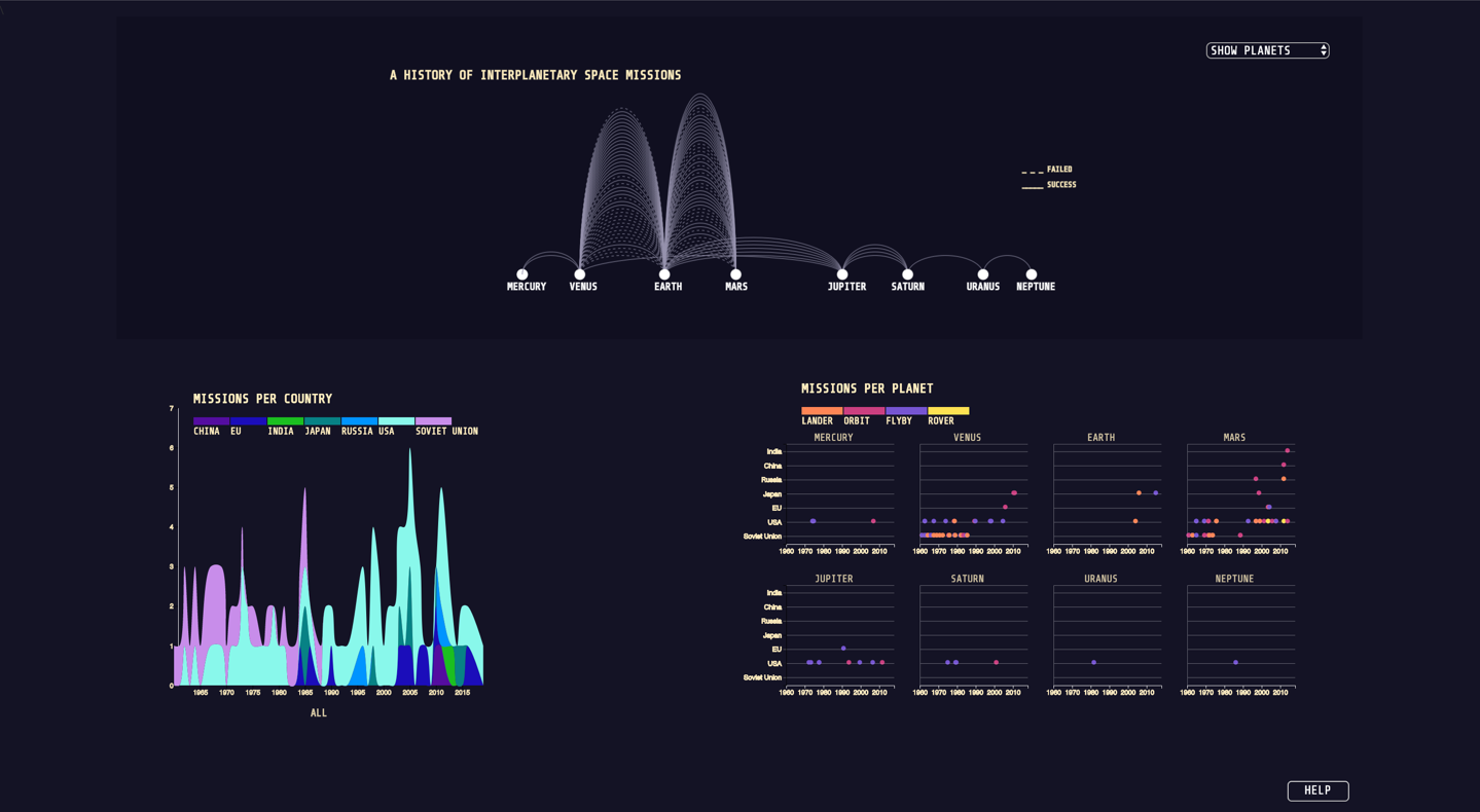
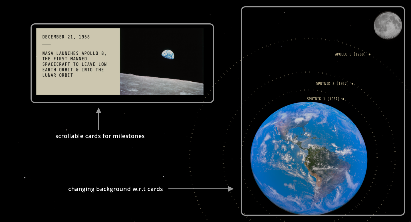
Scrolley telling layout
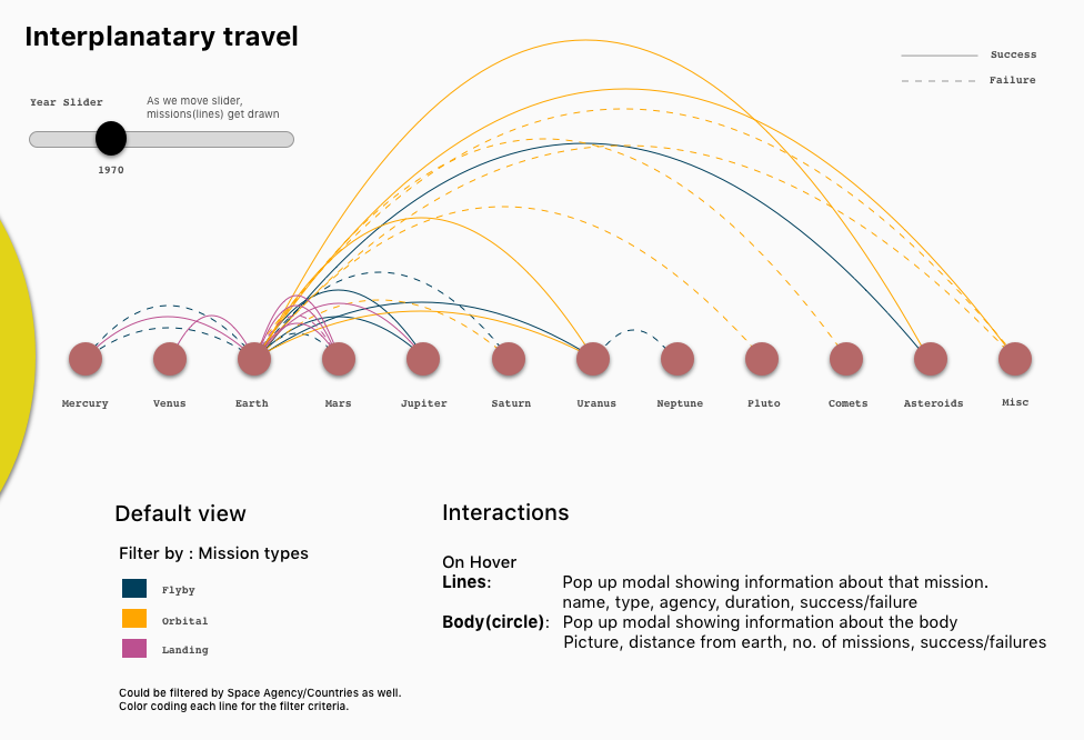
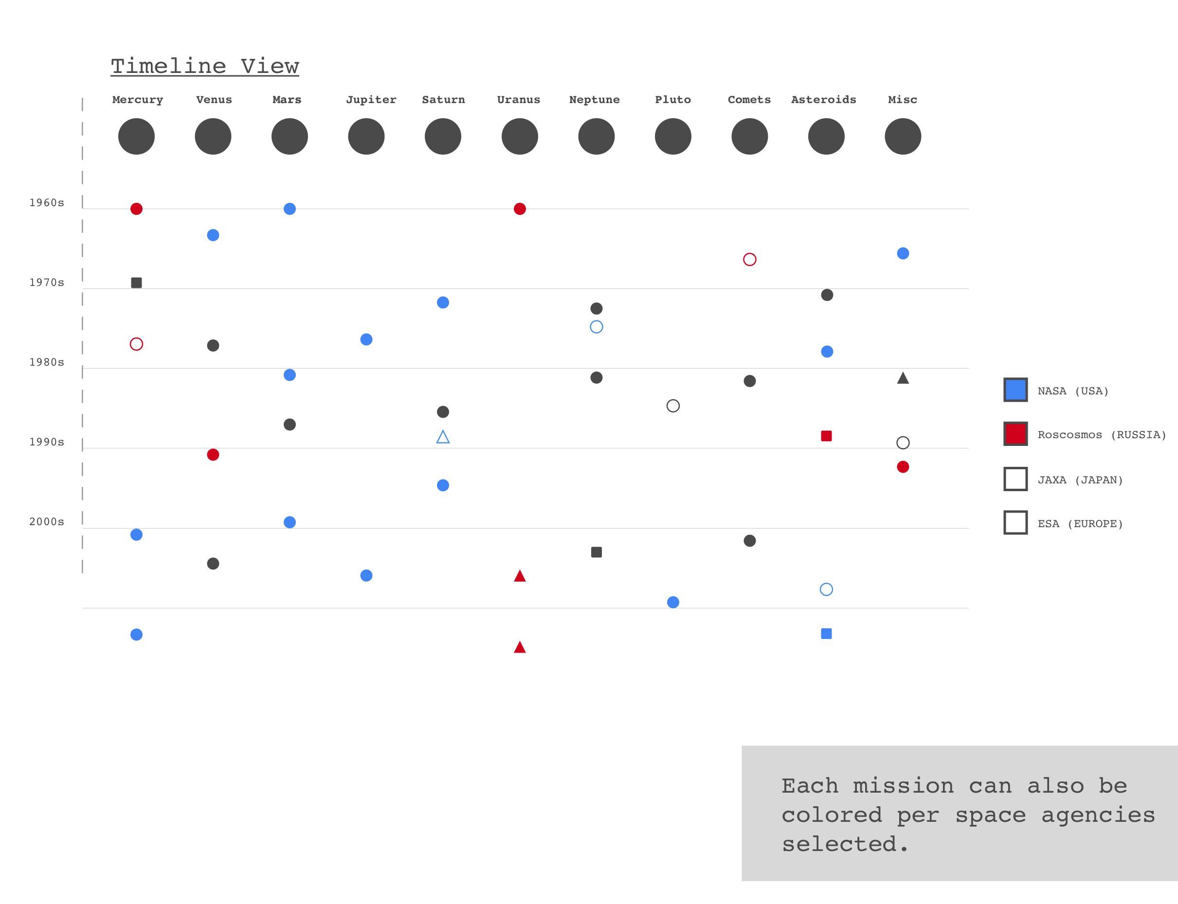
Interplanetary visualization layout
Other design details
Typography

We looked at multiple space data visualizations, Sci-Fi movie posters and Nasa documents for inspiration. One of our teammates found the Share Tech Mono typeface which we selected as we thought it was coherent with the overarching theme.
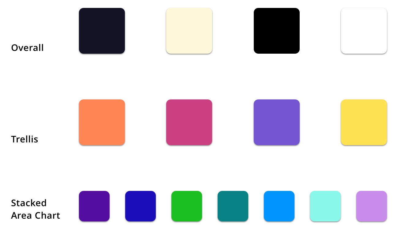
Color palette
Interactions
Representation and interaction are two equally important components of an information visualization. While designing interactions, I kept in mind that each interaction has to tie back to the user goals and add value to the entire experience.
Interaction 1: Scroll down to see milestones in space race and get to the main viz.
Interaction 2: Chose between all celestial body view or only planet view.
Interaction 3: Hover on arcs for mission details.
Interaction 4: Filter by planets for detailed analysis
Interaction 5: Hover over mission arcs for mission pathway and destinations
Interaction 6: Hover over other celestial bodies for their names
Interaction 7: HELP (How to interact with the viz)
My thoughts
I am proud of how Beyond Infinity turned out and enjoyed the entire process that brought us to the final version. Unlike other apps or websites, Beyond Infinity broadened my horizon to the field of information visualization where I got to learn and apply some domain-specific principles.
Goal-Driven Design Process
While designing the scrolley-telling as well as all the interactions, we started coming up
with numerous concepts that were unnecessary. Many of the interactions were thought of to make
it look visually polished or mask more data underneath. That started swaying the project and
hence we stuck to a strong goal-driven process which entailed adding interactions only to
fulfil a specific goal.
Colors are always tricky
We went through many iterations to finalize the colors for the different elements in the
visualization. We tried to strike a balance between elegance and utility, giving utility
a slight edge.
Trade-off between Visual Effect and Graphical Integrity
The planets and celestial bodies were arranged exactly to scale with respect to their
distance from Sun. We thought of making the planets equidistant from each other to make
it look uniform; but we decided to show the actual scale as we didn’t want the viz to
be misleading.
I proved to be the bridge between Design & Development
In a team of two designers and two developers, I was mainly a designer for this project but
I ended up coding some aspects of the visualization and made the scrolley-telling part.
My dev background helped me to communicate better with the developers which is
precisely why we were able to go through many iterations.